
Addleshaw Goddard
Direction with distinction. A meticulously designed signage, wayfinding and environmental graphics system brought clarity, brand presence, and visual harmony to Addleshaw Goddard’s Leeds and Manchester offices — seamlessly integrated with a high-spec interiors scheme.
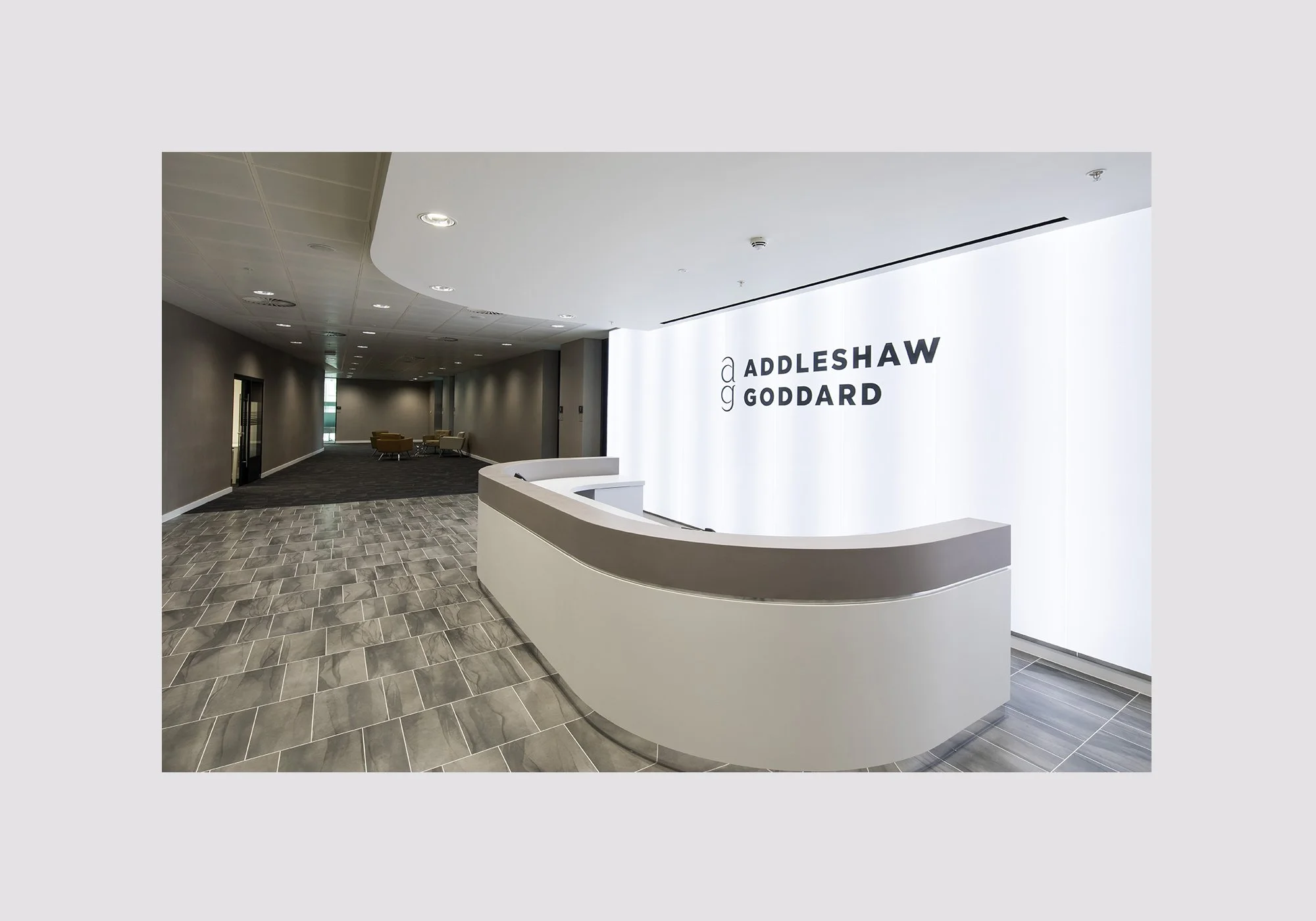
Addleshaw Goddard, an international law firm with a strong corporate identity, relocated into a newly designed multi-floor Leeds office space. The interiors, created by a specialist design team, were sleek, contemporary, and built to foster collaboration — but the building required a complete signage, wayfinding, and environmental graphics system to ensure the space functioned as effectively as it looked.
The project set out to create a cohesive navigation system that worked seamlessly across multiple floors, meeting rooms, and communal zones in both the Manchester and Leeds offices. This required a clear hierarchy of information and a consistent placement strategy to ensure intuitive wayfinding for staff and visitors alike.
A key objective was to translate the corporate brand into environmental expressions that felt at home within the interior architecture — enhancing, rather than overpowering, the carefully considered design schemes. Subtle brand cues, material choices, and graphic treatments ensured the identity was present without dominating the spaces.
The final goal was to balance functional clarity with premium aesthetics, delivering a scheme that not only met the operational requirements of two busy professional environments but also reflected the firm’s stature and reputation in the legal sector.


Working alongside project managers and interior designers, the signage and wayfinding strategy was embedded into the broader fit-out plan from the earliest stages. This ensured that material choices, sightlines, and lighting were all considered in harmony with the graphics.
A clear, hierarchical wayfinding structure was developed — from high-level floor identification to granular meeting room numbering. Signage was carefully placed to support intuitive navigation, reducing visual clutter while maintaining visibility.
Custom glazing manifestations were designed for meeting rooms, meeting pods, and breakout areas. These addressed privacy requirements while maintaining an open, light-filled atmosphere, and subtly referenced the corporate brand.
Distinctive graphics were created for key functional spaces, including the postal hub, breakout zones, and specialist work areas. Each design helped staff quickly identify facilities while contributing to the overall workplace aesthetic.
From locker numbering and directional signage to large-format environmental graphics, all elements adhered to a defined typographic, colour, and material system. This ensured that even the most functional signs felt integrated with the premium interiors.
The completed scheme provided intuitive navigation, visual cohesion, and brand reinforcement across both the Manchester and Leeds offices. Staff and visitors experienced an environment that was as functional as it was visually compelling, with improved navigation reducing wayfinding queries and boosting operational efficiency. The unified brand presence strengthened the firm’s identity without introducing visual noise, while the seamless integration with the interior design elevated the overall workplace experience in both locations.