Luto Research
Precision meets purpose. A full rebrand repositioned Luto as a modern leader in health communications, combining design clarity with strategic messaging to reflect the business’s unique expertise in evidence-based, user-tested pharmaceutical materials.
As experts in creating patient-facing materials for the pharmaceutical and healthcare sectors, Luto had the credibility — but not the clarity. The existing brand lacked cohesion, confidence, and a visual identity fit for the global healthcare leaders it partnered with. The goal was to evolve the brand without erasing its equity: modernising its look and feel, strengthening its messaging, and creating a toolkit that would carry the business into its next phase of growth.
The rebrand began with a full strategic reset, establishing a single-minded vision, purpose, and tone for the brand. Messaging hierarchies were developed for Luto’s three core audiences — internal teams, corporate stakeholders, and clients — ensuring relevance and clarity at every level. The internal brand challenged staff to "don’t go with the flow," while the client-facing narrative focused on Luto’s global expertise, rigorous testing, and unique ‘Audience Design’ methodology.
At the centre of the identity sits a custom “L” marque: a confident monogram inspired by the form of a folded leaflet. This simple visual cue references Luto’s core output while acting as a modern, flexible symbol of clarity and communication. It was designed to stand alone or support the full wordmark, creating brand recall across every touchpoint, from social icons to printed collateral.
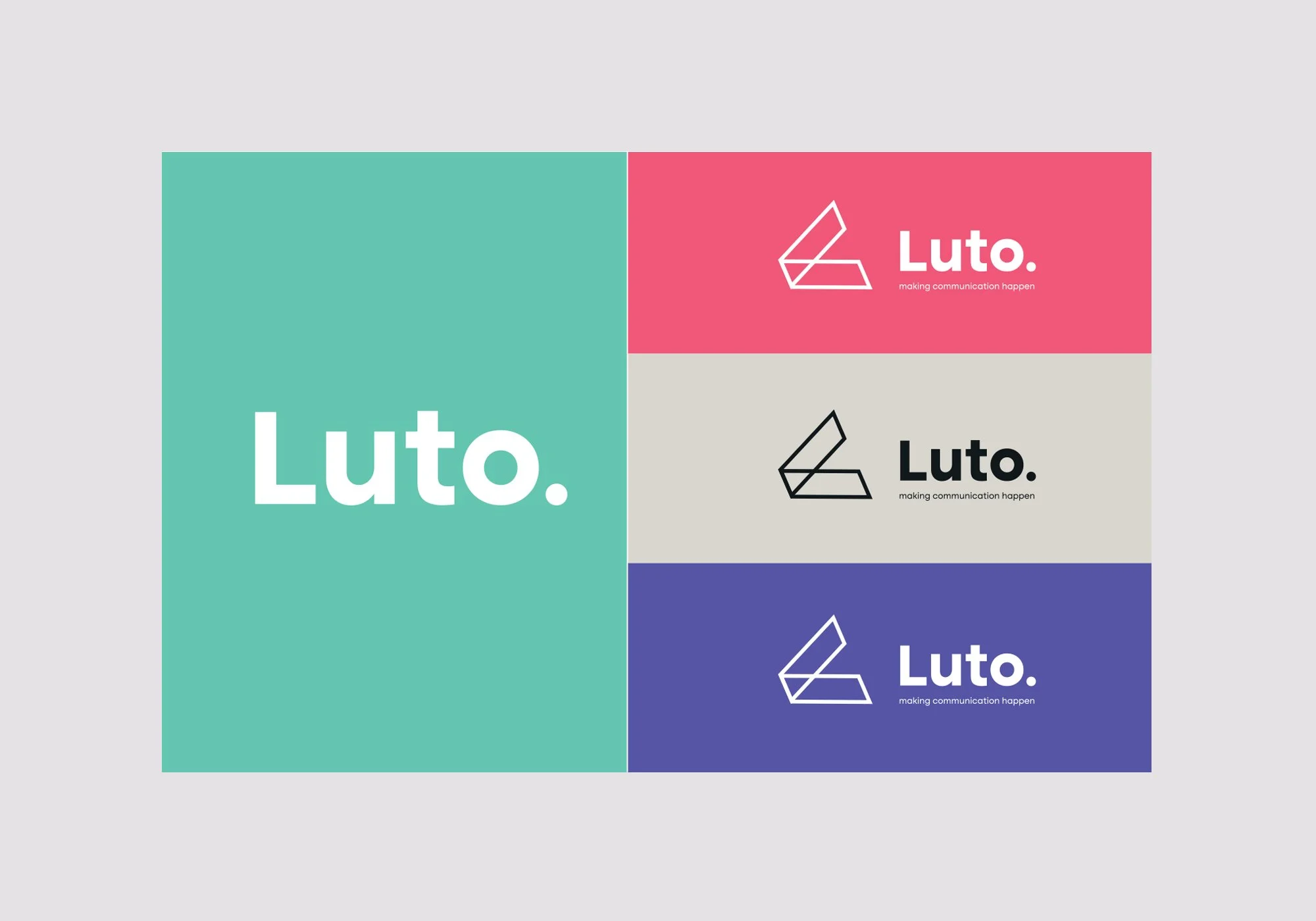
A bold, clinical colour palette brought vibrancy and clarity to the brand, with distinctive hues (like Luto Mint, Blush Red, and Slate Black) applied across digital, print, and physical formats. The chosen typeface, Altone, was applied in varying weights to give layouts a confident, accessible rhythm, aligning with Luto’s focus on legibility and ease of use.
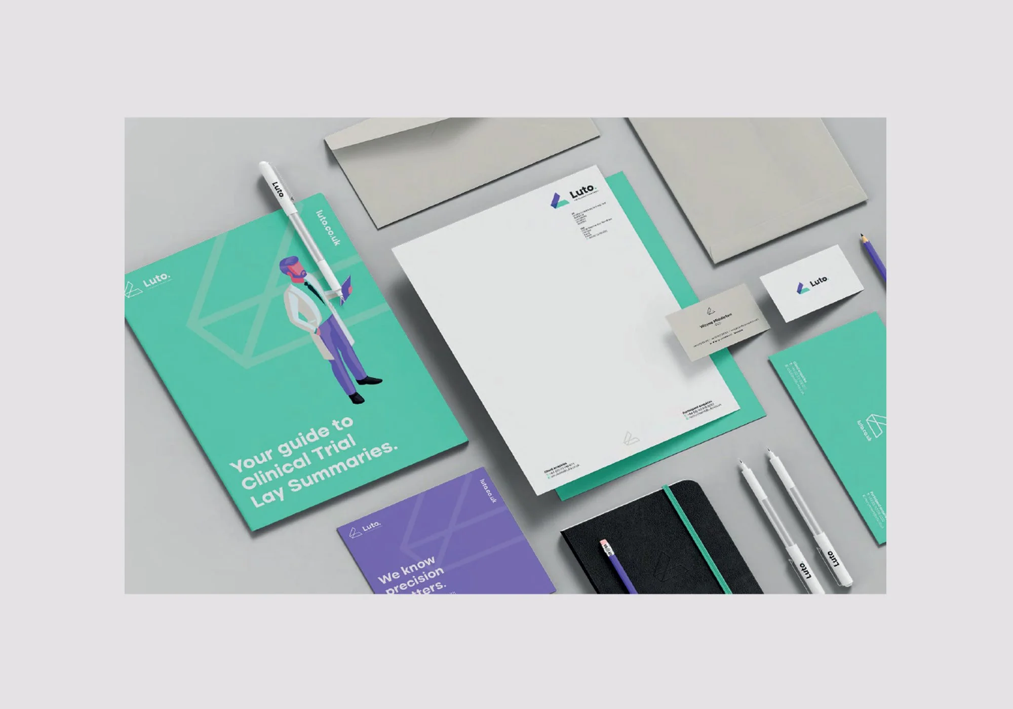
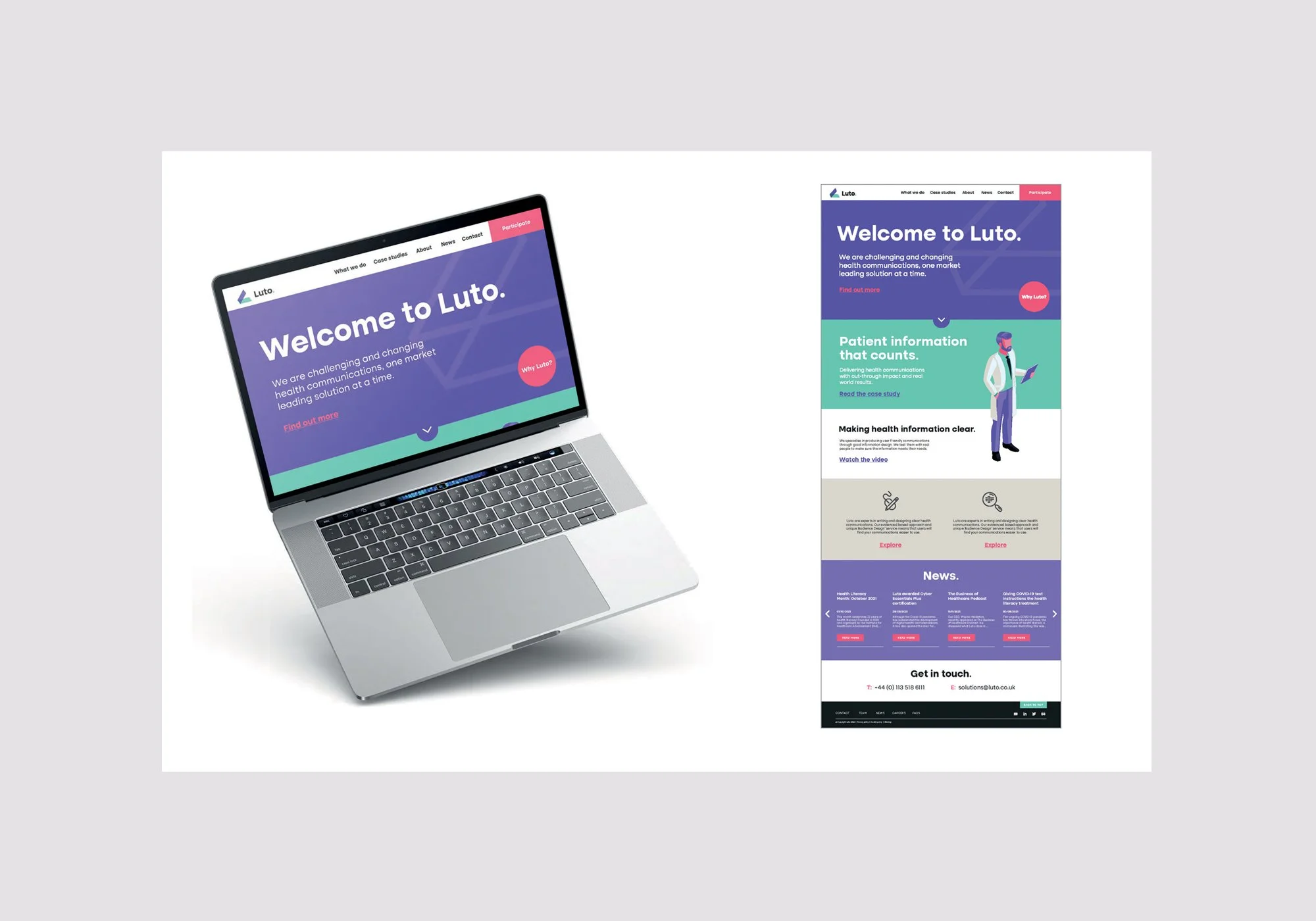
The rebrand extended across every element of the business, stationery and documentation systems, onboarding materials and culture guides, a new illustration style and iconography suite, website design, social templates and collateral.
Each application reinforced the brand’s commitment to “challenging and changing health communications” — creating a clear, cohesive experience for both internal and external audiences.